Fuel Frog
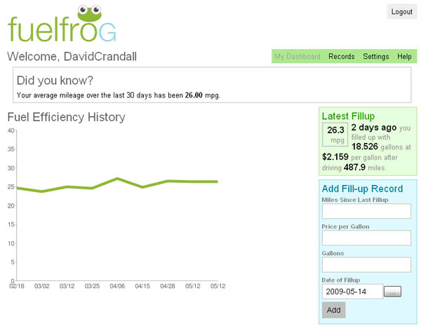
Let's start with the non-daily site. When reading their 'about' section, it says that the site was the result of a challenge: build a web application in less than three months. As of this coming Monday, I'll have been using their site longer than it took to develop.
The premise is simple: follow them on Twitter, send a direct message through Twitter (I use my phone to text this) that includes your Miles since last fill up, Price per gallon, and Gallons purchased or MPG. Over time it tracks your average actual mpg and generates a simple little graph.
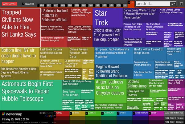
Newsmap
Generally, I hate the news. I don't mind clicking on a quick link that catches my attention, but I'm just not one for sitting through the evening news and when I go online to find something, there's just so much to choose from. Being the visual person that I am, when I found this site, I felt like I had found the answer I was looking for. Based on the Google News API, creator Marcos Weskamp has created a treemap illustrating what is current in the news. Colors are used for categorization while size indicates how many related articles the headline has. Mouseovers bring up a picture and quick description while clicking takes you to the actual story. I especially like that the click opens up a new window so as to leave the map itself alone.
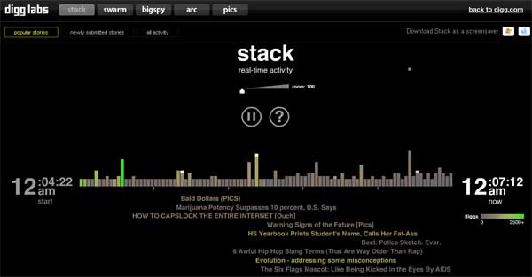
Digg Labs - Stack
Now here's the "news" I was more likely to read before finding Newsmap. Content posted by Digg users shows up across the screen. As people "Digg" a story, a stack falls from above and causes the bar to increase while the title drops below the chart as a clickable link. More popular stories show up as more green so you don't have to waste your time with those boring stories…like real news. Hey, that's what Newsmap is for, right? With Digg, you can read a story titled Jealous female gorillas solicit unproductive sex.
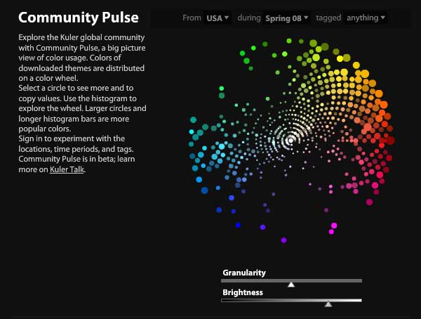
Adobe Kuler - Pulse
If you've played around with Adobe's Kuler site, then you know what it is to waste a few hours without realizing it. Another simple premise site: create a swatch of five colors and vote on other people's creations. You have the option of creating swatches out of the blue or you can upload a photo from which Kuler will extract the five colors.
Pulse is a bit of insight into all that voting data. At a glance you can see which colors on the color wheel are most popular. From what I can tell, blue-greens and violets must suck in most people's opinions. If you are asking WHY I use this site daily, it's because I have found it to be a great source of inspiration for illustration purposes. Try picking a random swatch and draw/illustrate/photo-manipulate whatever comes to mind. I also used it recently for a professional project as a tool for coming up with colors for a reporting suite.
Google Reader - Trends
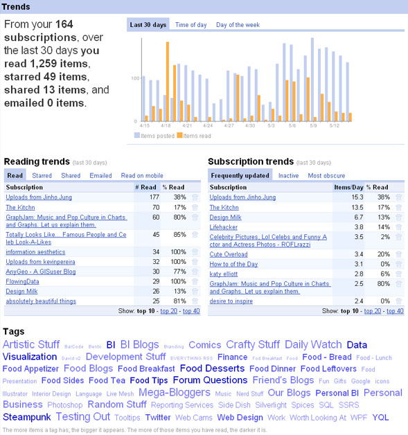
Now we get to one of my biggest addictions: Google Reader. I stumbled upon this little gem innocently enough when trying to find a way to manage the four blogs that I read at that time. Little did I know how it would literally change my life. What started as four blogs is now 164! Yes, there are a lot of posts that I don't read, but check out how many I HAVE read in the past month. I'm on the computer a lot.
Trends is nice because it helps me see a lot of interesting data about the blogs that I read and subscribe to. The tag cloud is nice to since it is entirely user generated. Very helpful for finding things of interest later. I'm curious what other people's Trend reports would look like.
What data driven sites do you frequent on a regular basis? Do they feature stunning visuals (Pulse) or simple graphs (FuelFrog)? Do they drive what you are reading (Newsmap and Stack) or show what you've read (Trends)?


No comments:
Post a Comment