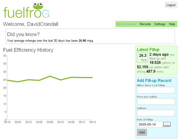
Thursday, May 14, 2009

Five Data Tools I Won't Do Without

Too often people think spreadsheets when they hear the term 'data'. I think that trend is starting to change though with so many sites dedicated to data visualization and information aesthetics. Of the five sites I've listed, I look at four of them daily; the fifth I look at every time I fill up my car. I know that these aren't the latest and greatest data visualizations, but you already understand the credit crisis now...and no matter how cool that sanke diagram you just saw is, you're probably not going to look at the same one every day. (Relax, I loved the credit crisis video...and I'm a big fan of the Sanke blog, so don't skip to the end and leave hate comments.)


Fuel Frog
Let's start with the non-daily site. When reading their 'about' section, it says that the site was the result of a challenge: build a web application in less than three months. As of this coming Monday, I'll have been using their site longer than it took to develop.

The premise is simple: follow them on Twitter, send a direct message through Twitter (I use my phone to text this) that includes your Miles since last fill up, Price per gallon, and Gallons purchased or MPG. Over time it tracks your average actual mpg and generates a simple little graph.
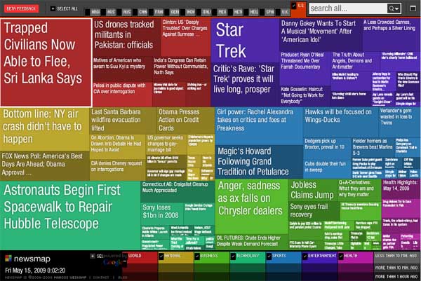
FuelFrog


Newsmap
Generally, I hate the news. I don't mind clicking on a quick link that catches my attention, but I'm just not one for sitting through the evening news and when I go online to find something, there's just so much to choose from. Being the visual person that I am, when I found this site, I felt like I had found the answer I was looking for. Based on the Google News API, creator Marcos Weskamp has created a treemap illustrating what is current in the news. Colors are used for categorization while size indicates how many related articles the headline has. Mouseovers bring up a picture and quick description while clicking takes you to the actual story. I especially like that the click opens up a new window so as to leave the map itself alone.
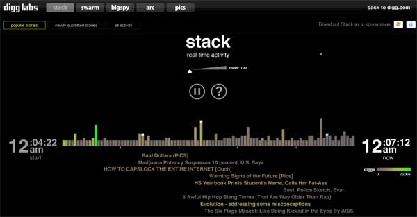
Newsmap


Digg Labs - Stack
Now here's the "news" I was more likely to read before finding Newsmap. Content posted by Digg users shows up across the screen. As people "Digg" a story, a stack falls from above and causes the bar to increase while the title drops below the chart as a clickable link. More popular stories show up as more green so you don't have to waste your time with those boring stories…like real news. Hey, that's what Newsmap is for, right? With Digg, you can read a story titled Jealous female gorillas solicit unproductive sex.
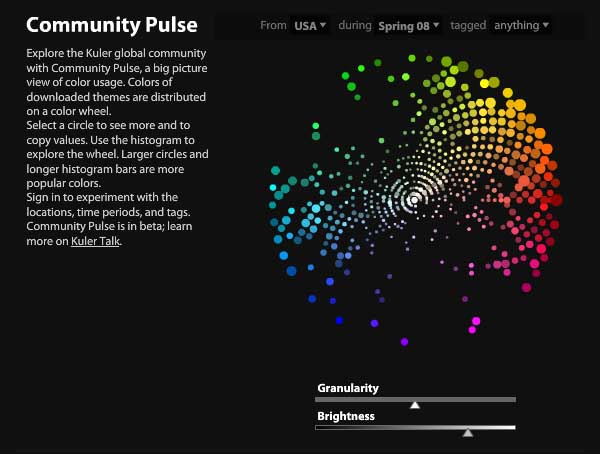
DiggLabs_Stack


Adobe Kuler - Pulse
If you've played around with Adobe's Kuler site, then you know what it is to waste a few hours without realizing it. Another simple premise site: create a swatch of five colors and vote on other people's creations. You have the option of creating swatches out of the blue or you can upload a photo from which Kuler will extract the five colors.

Pulse is a bit of insight into all that voting data. At a glance you can see which colors on the color wheel are most popular. From what I can tell, blue-greens and violets must suck in most people's opinions. If you are asking WHY I use this site daily, it's because I have found it to be a great source of inspiration for illustration purposes. Try picking a random swatch and draw/illustrate/photo-manipulate whatever comes to mind. I also used it recently for a professional project as a tool for coming up with colors for a reporting suite.

Kuler_Pulse


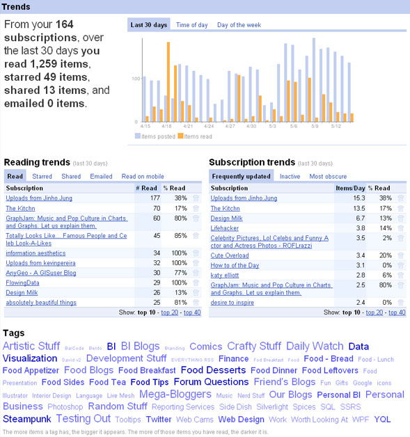
Google Reader - Trends
Now we get to one of my biggest addictions: Google Reader. I stumbled upon this little gem innocently enough when trying to find a way to manage the four blogs that I read at that time. Little did I know how it would literally change my life. What started as four blogs is now 164! Yes, there are a lot of posts that I don't read, but check out how many I HAVE read in the past month. I'm on the computer a lot.

Trends is nice because it helps me see a lot of interesting data about the blogs that I read and subscribe to. The tag cloud is nice to since it is entirely user generated. Very helpful for finding things of interest later. I'm curious what other people's Trend reports would look like.

GoogleReader_Trends


What data driven sites do you frequent on a regular basis? Do they feature stunning visuals (Pulse) or simple graphs (FuelFrog)? Do they drive what you are reading (Newsmap and Stack) or show what you've read (Trends)?

Tuesday, May 12, 2009

Google Search]ology

Just finished listened to the Google Webcast Search]ology and was very excited about the technology that was conveyed. While there were a number of things revealed, easily the one that made me want to jump out of my seat was Google Squared. This technology will be revealed through Google Labs later this month, but the demo looked absolutely amazing. Instead of returning results in the normal short paragraph type style that we have come to expect of Google, Google Squared will return results in a table-like format with rows and columns like a spreadsheet. Not only can the user add rows and columns, but they will be able to modify individual cells with other search results if the data present in them is not up to par with the user's expectations. (As a data fanboy, I actually let out a little yell in my empty workspace. Thankfully, no one was here to make fun of my geeky bliss.)

One of the questions asked at the end addressed the possibility of there being a danger of Google using data without actually referring searchers to the websites that the data is referencing. Marissa Mayer (who actually presented Google Squared) responded that Google wants to take the web and transform it into something that could possibly be more useful than the actual websites where the data came from, but that they would still heavily site the reference sites where the data came from thus still driving click throughs to the source site. Unfortunately, when the online question was asked as to when this would be available, Marissa responded with a nondescript "Official word is later this month." I can't wait!

Another comment made by Marissa was "We are always striving for the ideal or perfect search engine." One of the attendees picked up on this with their question: How much closer are you to this? She replied "I think search is really in its infancy. While we are proud of google there is a long way to go. ... It has awakened to me how very far away we are. ... While we are really proud of what we have done, it just shows how big the search space really is and how exploratory[?] it is." [? used to indicate that I'm not sure if that was the word used.]

Another really exciting search, while not as useful in my daily life but certainly more fun, was Google Stars. Think Google Maps but of the night sky. Sounds mildly interesting at face value until you saw how the application interacted with an Android enabled phone. Using location and position information, the user can hold the phone up to the sky and the phone knows where they are pointing. It acts like a window to the sky and displays the sky behind the phone with the stars, constellations, and names on the screen. That is fairly amazing to me. Also, users can search for particular places (in the demonstration, they searched for Gemini) and a circle with an arrow appears. The arrow tells the user where to move the phone, for example up and to the right, so that the phone is used as a finder for where the object is located in the sky. Tell me that isn't cool!

One last technology that looked not only useful but fun was the Google Wonder Wheel. This application shows a topic diagram with the main topic in the center and related topics at the end of spokes. The user can select one of the spokes to recenter the view. This looks useful in that it will help users dig into topics and find related ones much easier than previously they were able to do. Being a data visualizer, I loved the fact that it was very visually based and not just text.

I believe Udi Manbar, the first presenter, summed up the entire presentation nicely when he said this: Every five years is science fiction. ... You haven't seen nothing yet.